Wednesday, 4 May 2011

Target audience summary

Target audience summary-
I have decided my magazine will be aged at older teens to mid twenties, aging from 16-25. It will be aimed at male and females who are interested in R&B and hip-hop with elements of fashion with this theme and what the celebrities are wearing. 
My front cover should have a simple and basic design as i don’t want it to be “busy” as it will draw attention from the masthead and picture. I also want a plain colour scheme of about three colours as the attention will go strait to the masthead and picture.

Focus group

Focus group
I asked a group of ten seventeen year olds their opinions of two music magazine covers their opinions of the fonts used, use of pictures and what they generally like and dislike about them.
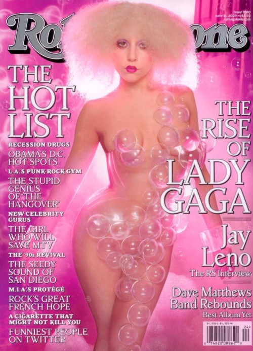
Rolling stones magazine-
Likes-  
Masthead- The majority of the group like the masthead as it is the original Rolling stones font.
Pictures- The main picture is of lady gaga and my focus group liked to see someone so famous on the cover.
Colours- they liked the use of pink over the whole cover as they said it ‘made it stand out’
Font- ‘the font was easy to read but yet still stood out’ most of the focus group agreed and felt that it was appropriate considering the bold colour of the picture.

Dislikes-
Masthead- ‘i didn’t like the fact the title was covered by Gaga’s head’ some of the focus group agreed the masthead being covered you couldn’t really see what magazine you was buying.
Pictures- Even though the majority of the group liked the picture of Gaga and the position the actual picture itself they said she looked ‘dead in the face’ and found that off putting.
Colours- The focus group liked the colours as they said it was ‘bold’ but felt it didn’t appeal to the male audience as much as female.
Font- they liked the general font but felt some of it was too small and found it hard to read. Also that there was too much for one front cover.

VIBE magazine
Likes-
Masthead- the focus group really liked VIBE’s masthead they said ‘it really stood out’ and ‘could see it was the title clearly’
Pictures- They liked the comic/cartoon appeal of the picture and the colour against the background.
Colours- ‘the pink, green and blue worked well against the white background’ they mostly agreed that the colours worked well and stood out.
Font- They liked the way the font was simple and easy to read and there wasn’t too much of it.

Dislikes-
Masthead-They felt making it appear translucent and overlapping other writing over it made it less appealing.
Pictures- They liked the cartoonised picture but also said it made the picture appear bland and just didn’t stand out as much.
Colours- the use of colour they liked and didn’t really have any negatives except the background colour being white and said it felt too ‘harsh’.
Font- They said the font along the left hand side was a bit too small and just seemed to fade.

Overall the focus group decided they preferred VIBE’s magazine cover as it was less fussy and seemed to stand out more on a shelf even though Lady Gaga attracted them to Rolling stone’s magazine.

Saturday, 16 April 2011

Survey Results and Analysis


1.    What gender are you?
-      66.7% of people who answered were female and 33.3% were male, so my magazine should have more female aspects in aswell as men.

2.   How old are you?
-      77.8% of people who answered were aged 14-17 with 11.1% being 8-13 and 26+
-      So my main target audience is teens going into young adult.
3.   What music Genre do you listen to?
-66.7% answered R&B and Rap
-33.3% chose Indie
-11.1% metal and 11.1% chose clubland
- so my music Genre of my magazine should be R&B and Rap as this genre seems to be the most popular choice of music.
4. when looking at a magazine, what colour scheme works best?
  - Red, white and black had the highest ratings with 66.7% of the vote.
  -pink, purple and white came in at 3rd with 11.1% of the vote
  -black, pink and white 22.2%
  -Green, blue and yellow with 0%
  -Red white and black came out with the highest vote, this is the colour scheme i will use as it fits in with the target audience and Fits the colour scheme of the VIBE magazine cover.

5.Which music magazines do you buy? Please specify..
   -top of the pops- This is quite a childish magazine and not in       my desired target audience range.
   -Metal Hammer- Is a Heavy metal magazine and even though its not the main Genre i would like i could still add elements of metal in the magazine.
   -NME
   -Q
 -Shout/Mizz/ELLE-These three magazines aren’t really music based but still have elements of music in them.
 

6.How often do you buy a music magazine?
  -Every day-0% this shows that people dont tend to buy music magazines religiously.
  -twice a week-0%
  -Once a week-0%
  -every fortnight- only 11.1% of people who answered bought a music magazine every fortnight
  -once a month-33.3% this shows music magazines are purchared on average once a month. If at all.
  -Rarely-55.6%

7.When looking through a music magazine would you prefer other interests as well?
-88.9% of people selected Yes. With the highest option being fashion as the highest other interest.
-11.1% selected to have no other interests in a music magazine.

Overall Analysis.

My magazine should be mainly aimed at women who are young adults or older teenagers. The main genre will be R&B and hip-hop with a colour scheme of Red, white and black and should be sold monthly and have elements of fashion in.


Survey (copy and paste into the address bar)

http://www.surveymonkey.com/s.aspx?PREVIEW_MODE=DO_NOT_USE_THIS_LINK_FOR_COLLECTION&sm=dJ4HkNYpnX7UwTT7i3InDKbccH6ekVpnqizmCTLNvv4%3d

Conventions of a Music magazine


Conventions of a music magazine.

Double page spread:
Artist names in the corner of the page make it easy for one off readers to negotiated their way through the magazine, they are not necessarily familiar with the format of the magazine so it makes is more convienient for them to find their way through the music magazine.
The two pages together continue the same colour scheme. They do not have the same colour scheme, this breaks up the magazine into seperate articles and makes each page stand out.
The picture accompianing the article takes up one of the pages, it also has eye contact with the reader, connectimg with the audience.
Quotes from the article are used between the articles to break up the page and makes it noticable to readers if they are flicking through the magazine.
The articles are all introduced with are couple of sentences larger than the article (or in a different colour) this breaks up the larger chunks of text on the page. The aricle are all written in columns with page number that continue the brand of the magazine.

Contents page:
The contents page is often titled as 'Contents' this clearly identifies the page and is convienient for the reader.
The contents page continues the colour scheme of the front cover. This continues the brand identity and keeps the constant house theme running through the cover and the contents of the magazine.
There are quotes accompanying the contents of the magazine that tease the articles and make people want to read them.
As well as having a list of the contents, there are pictures with it to advertise the articles. Also a further picture of the main aricle from the front cover.
The contents page is always ordered and not cluttered. Everything has its own place and it is clear and easy to read. This makes it easy to negotiate from as people dont always read the page top to bottom but flick to and from it to find articles. External advertisements are used on the contents page, these are from the institution and often advertise things such as subscriptions. These advertisements would not fit in anywhere else in the magazine and it is also a good place to put them as it if the first page of the magazine people see.


Cover:
The picture on the cover creates eye contact with the reader. The model is positioned to be looking straight at the lense which connects with the readers and makes it noticable on the shelf.
The coverlines on the cover tease the contents of the music magazine. They make people want to read the magazine and will notice it more in the shop if it is in interesting or different coverline or quote from one of the articles.
The cover has a bold clear colour scheme which makes it look appealing on the shelve. Teen music magazines tend to have a bright colour scheme to make it appeal to that specific target market. Colours such as these are bright yellows, pinks and red, which appeal especially to the teenage girls if they glance at it in the shop.
There is a logo (masthead) which is easily recognisable and creates a brand identity. It is used for identification if seen at a glance in a shop.
Pull quotes are often used on the covers of magazines to make people want to read the articles. They are often the most interesting or revealing quote in the interview so people see them and makes them want to read the whole of the article.
Other less important but constant features are price, barcode and issue number. This things are often smaller on the cover as they are less important but included for customer convenience

Friday, 8 April 2011

x magazine, front cover, contents page and Double page spread.

X Magazine double Page Spread analysis


The first half of the double page spread is split into three columns, like the font cover. At the top the first section is three pictures again like the cover, and each picture gradually gets bigger which takes away from the writing looking too much and give the reader something to look at other than reading.
The article is about Charlotte Church as she has a new album which is why the magazine would feature her.

The second page features a picture of charlotte church from her phtoshoot for her new album the heading for the article is a quote from charlotte and is on a orange background which links with the cover and contents page. The colours pink,black and white are used here again to relate with the cover.

The form of text is informal which matches with the style of the picture. There are several picures of her all different to show she’s ’normal’.